The cost of small frictions
Role: Lead UX Designer
Client: BASF Coatings
Time: 2023
BASF's color matching application, Refinity, was losing an estimated $1 million per month — not as a result of technical failure, but due to compounding UX inefficiencies.
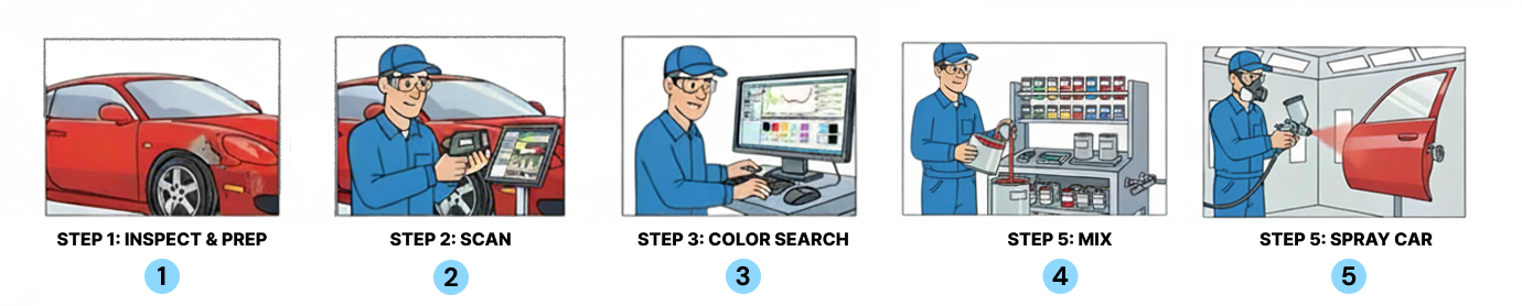
Automotive painters rely on the tool daily to identify and mix the correct formula for matching aged, faded vehicle paint. Because painters are compensated per job rather than per hour, every point of friction carried a direct financial consequence — for the painter, the body shop, and BASF.
Overview
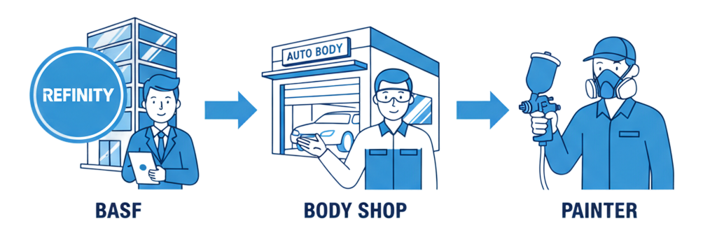
Refinity operates within a B2B2C model: BASF sells to body shops, but painters are the primary end users. This created a dual design challenge — addressing BASF's measurable revenue loss while resolving the day-to-day frustrations of the people actually using the product.
I led the end-to-end redesign of the Color Module across its two core workflows: Scan and Mix.
The Problem
The Color Module was failing its users in two distinct but equally costly ways.
1. Scan: Decision Bias
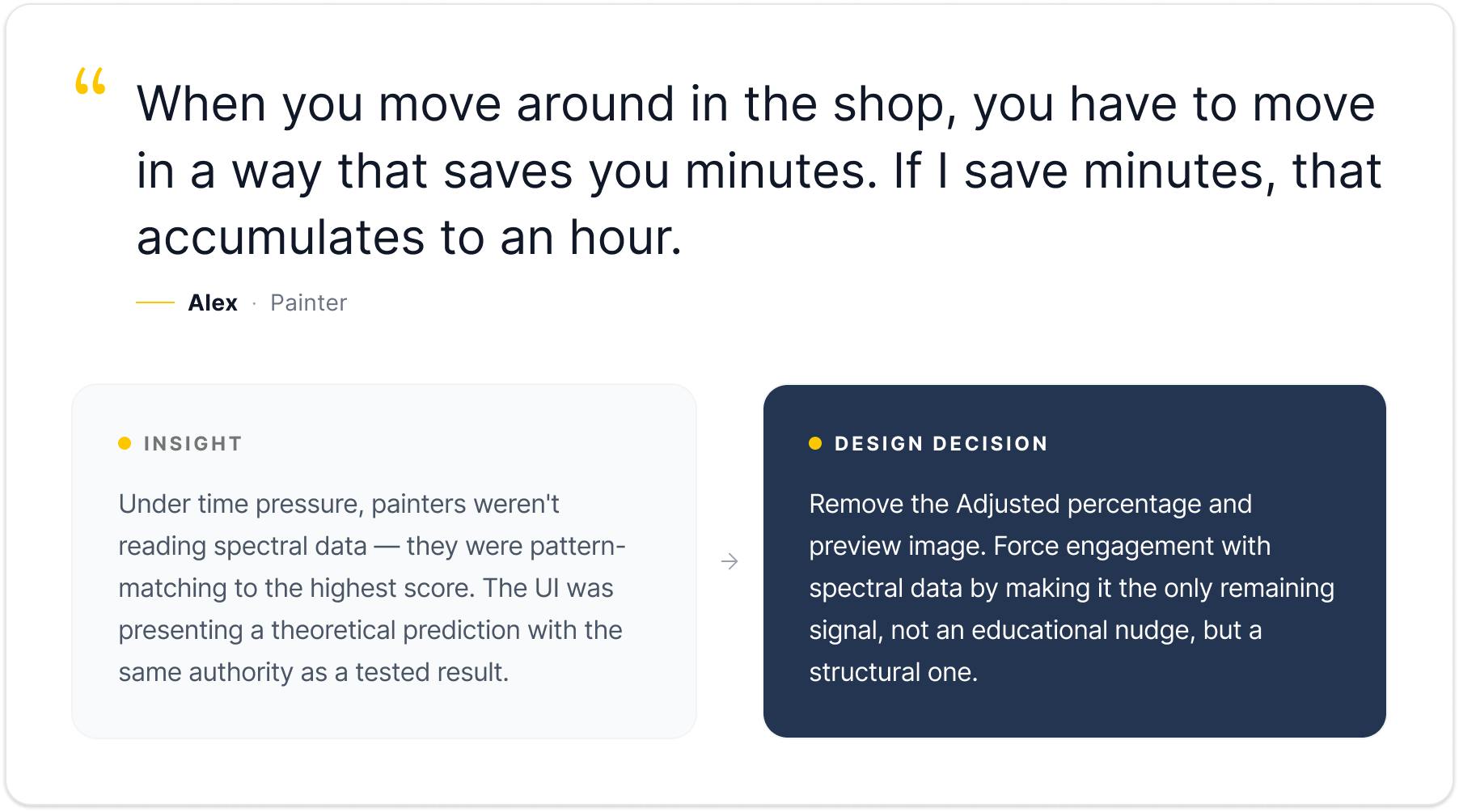
The Scan workflow displayed three formula options — Original (OEM), Target (live vehicle scan), and Adjusted (a system-generated prediction) — each alongside a percentage match score and a traffic light indicator.
The score carried disproportionate visual weight. Under time pressure, painters consistently defaulted to the highest number. If the Adjusted showed 96% and the Original showed 92%, the choice felt obvious — even though that confidence was unfounded. The Adjusted formula is a theoretical prediction, not a tested result, but the UI presented both with equal credibility.
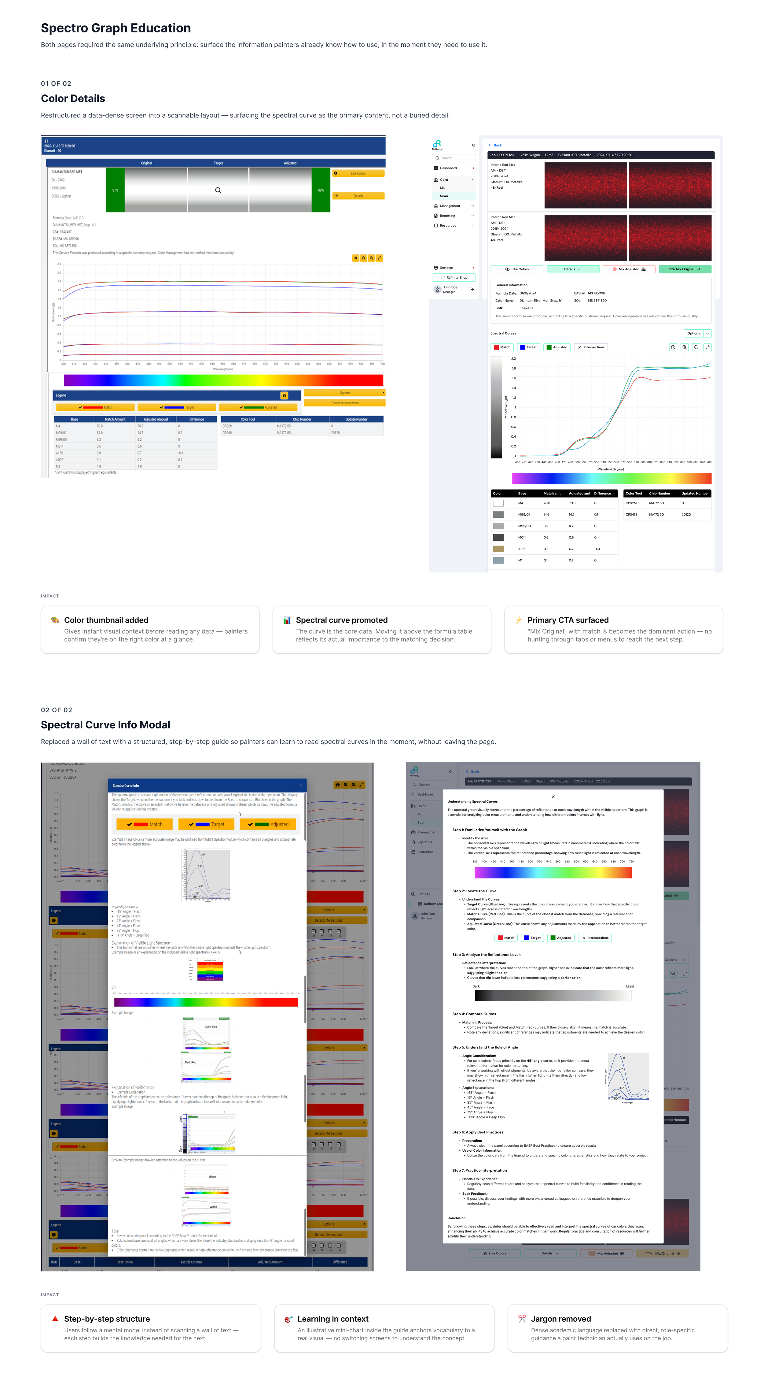
Spectral curves — a far more reliable signal requiring genuine professional expertise to interpret — were largely ignored as a result.
When the prediction was wrong, painters blamed their own judgment rather than the tool. Over time, this eroded professional confidence, discouraged spectral engagement, and created a growing dependency on an algorithm with a known failure mode. Left unaddressed, new painters would never develop analytical skills, experienced painters would progressively disengage from spectral evaluation, and the platform would lose its credibility as a professional-grade tool.
2. Mix: Structural Friction
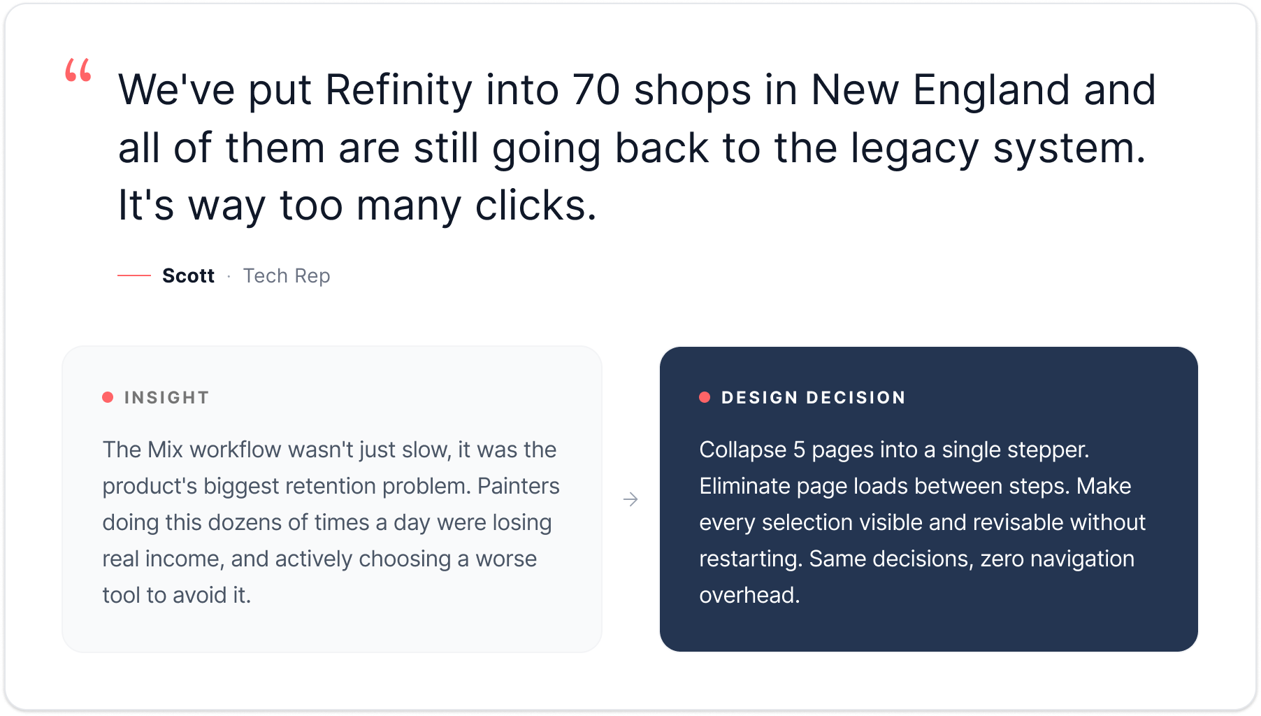
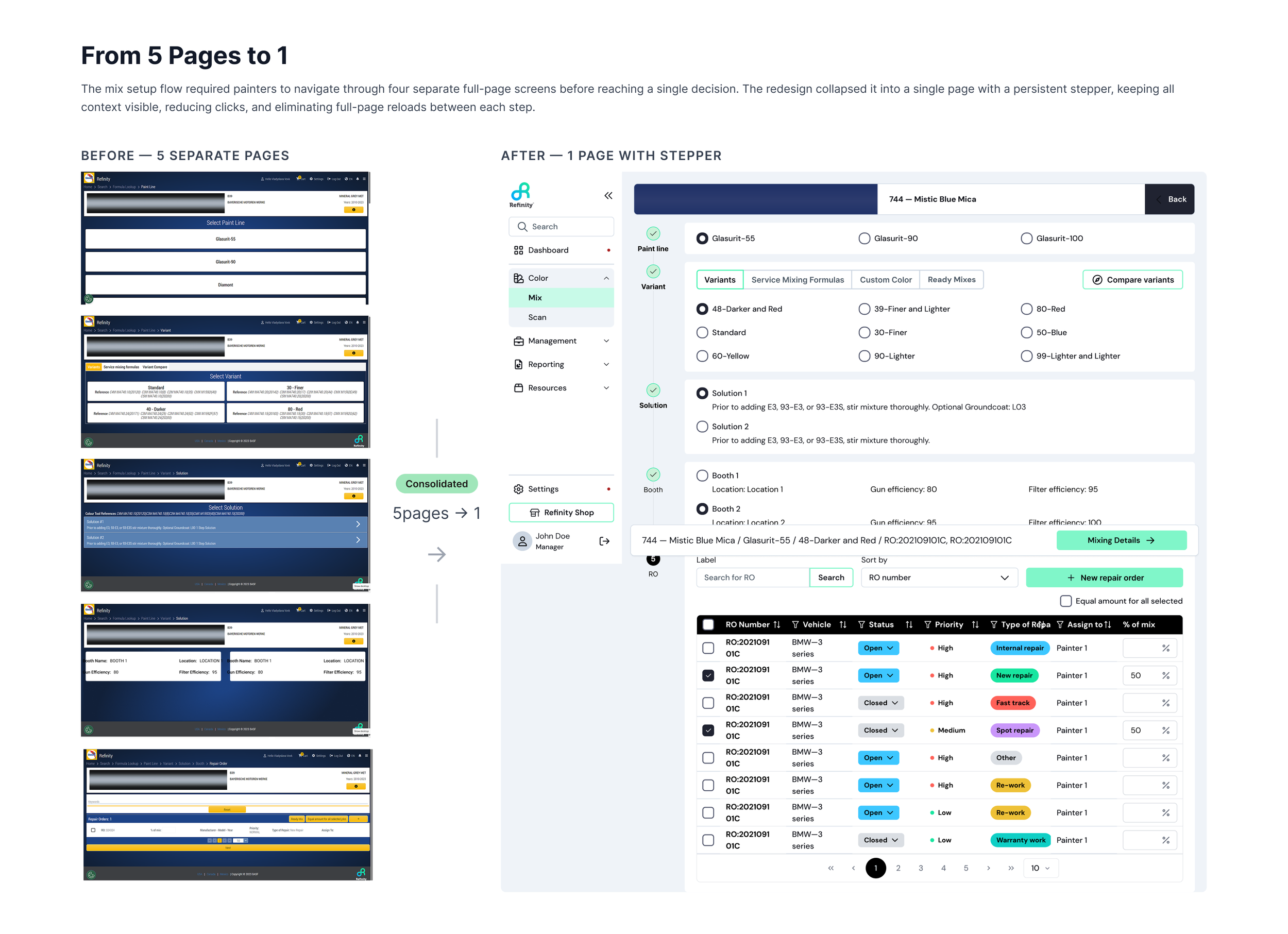
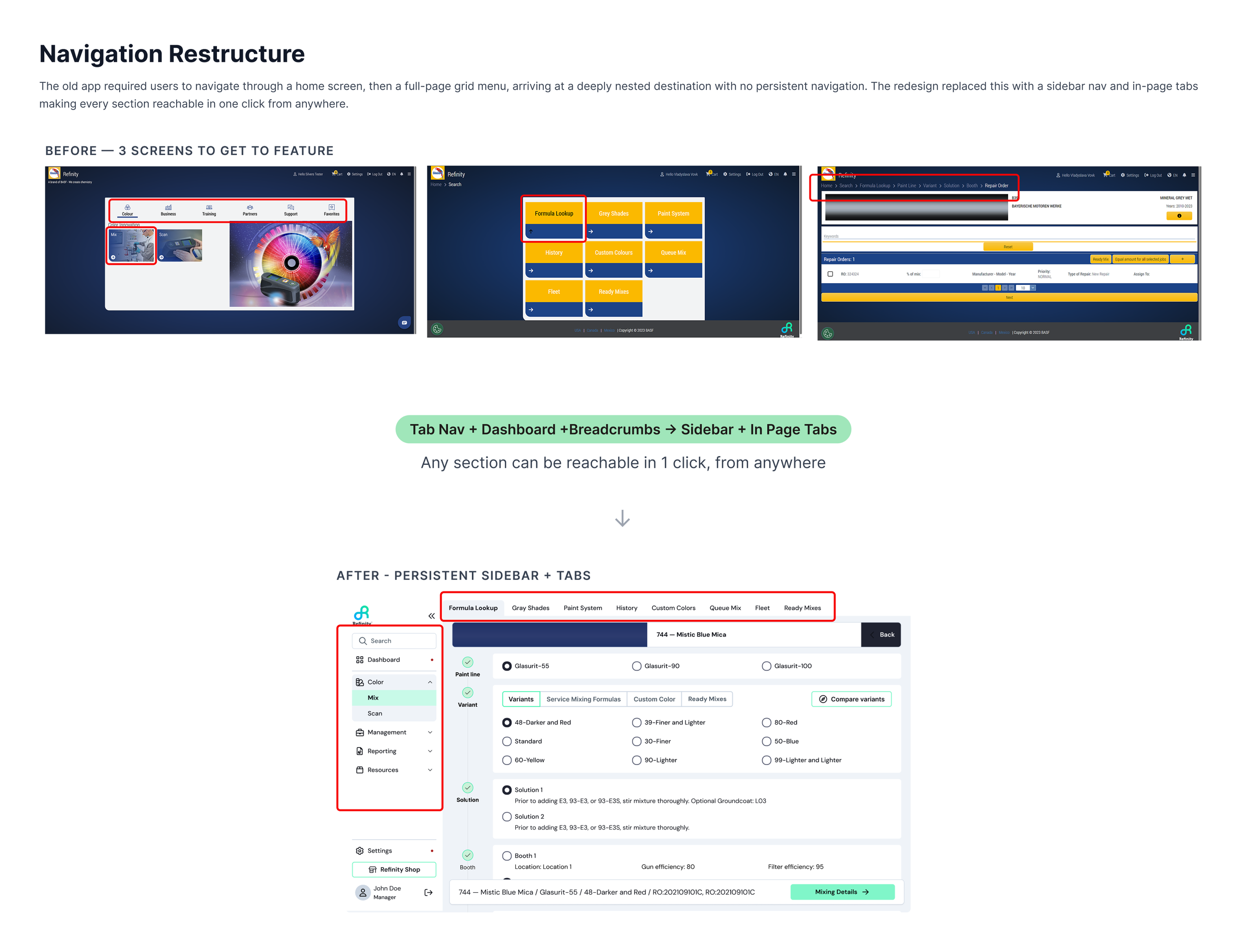
Completing a single Mix workflow required navigating five separate pages to make five interconnected selections: paint line, variant, booth, repair order, and final confirmation.
Not because the task demanded it — because the architecture did.
Each step lived on its own screen, separated by a page load and a confirmation click. Back navigation relied on small breadcrumb links poorly optimized for a fast-paced shop environment, meaning small mistakes felt like full restarts.
For painters repeating this process dozens of times a day, the cumulative cost was substantial. Research from UC Irvine found that even minor task interruptions take an average of 9.5 minutes to recover from, and industry data indicates employees lose an estimated 4 hours and 38 minutes per week to repetitive task overhead alone. Compounded across a full working day, those page loads and forced transitions were quietly eroding earnings and fueling frustration.
Research & Discovery
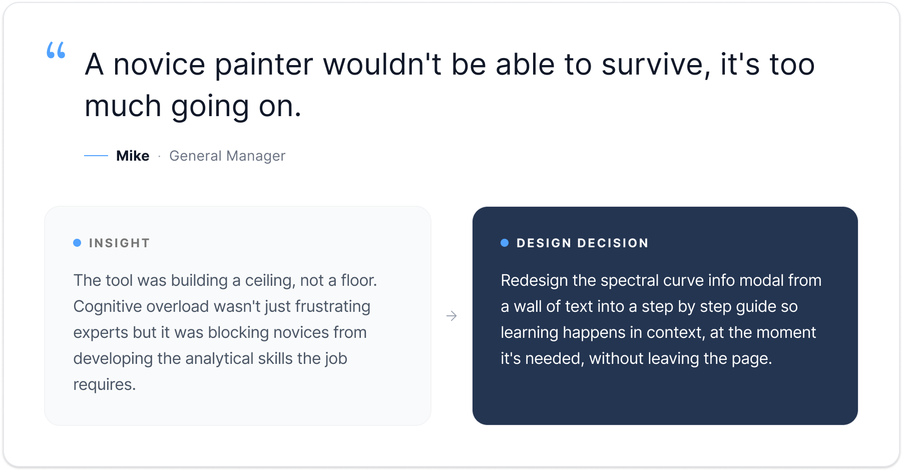
I conducted qualitative interviews with approximately 50 qualitative interviews globally, spanning experience levels, shop sizes, and regional markets. Two distinct problem categories emerged, one behavioral, one structural, and together they became the foundation for the redesign.
The Redeisgn
Both problems required different solutions, but the same underlying principle: remove what was working against the painter without removing what the painter needed.
Part 1: Scan
The Scan workflow is where painters upload their car scans and select which formula to use. This is the first critical decision point, and getting it right saves time and materials later in the Mix workflow.
The redesign restructured the information hierarchy to support professional judgment rather than shortcut it.
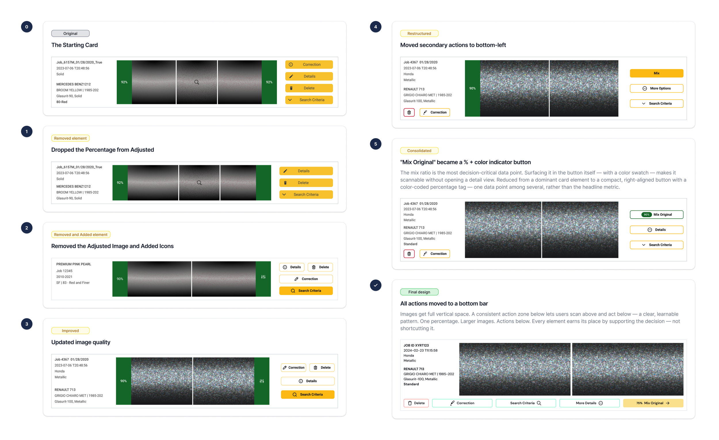
Removed the percentage from the Adjusted formula. Where a painter previously saw two numbers and picked the higher one, they now saw two green indicators and a single percentage, forcing the only logical next step: engaging with the spectral data.
Removed the Adjusted preview image. A rendered prediction of a theoretical result was generating false confidence the UI had no basis to support.
Relocated traffic light indicators to the Details page. Painters could now compare all formula options alongside their spectral curves in a single view, making spectral review a structural requirement rather than an optional step.
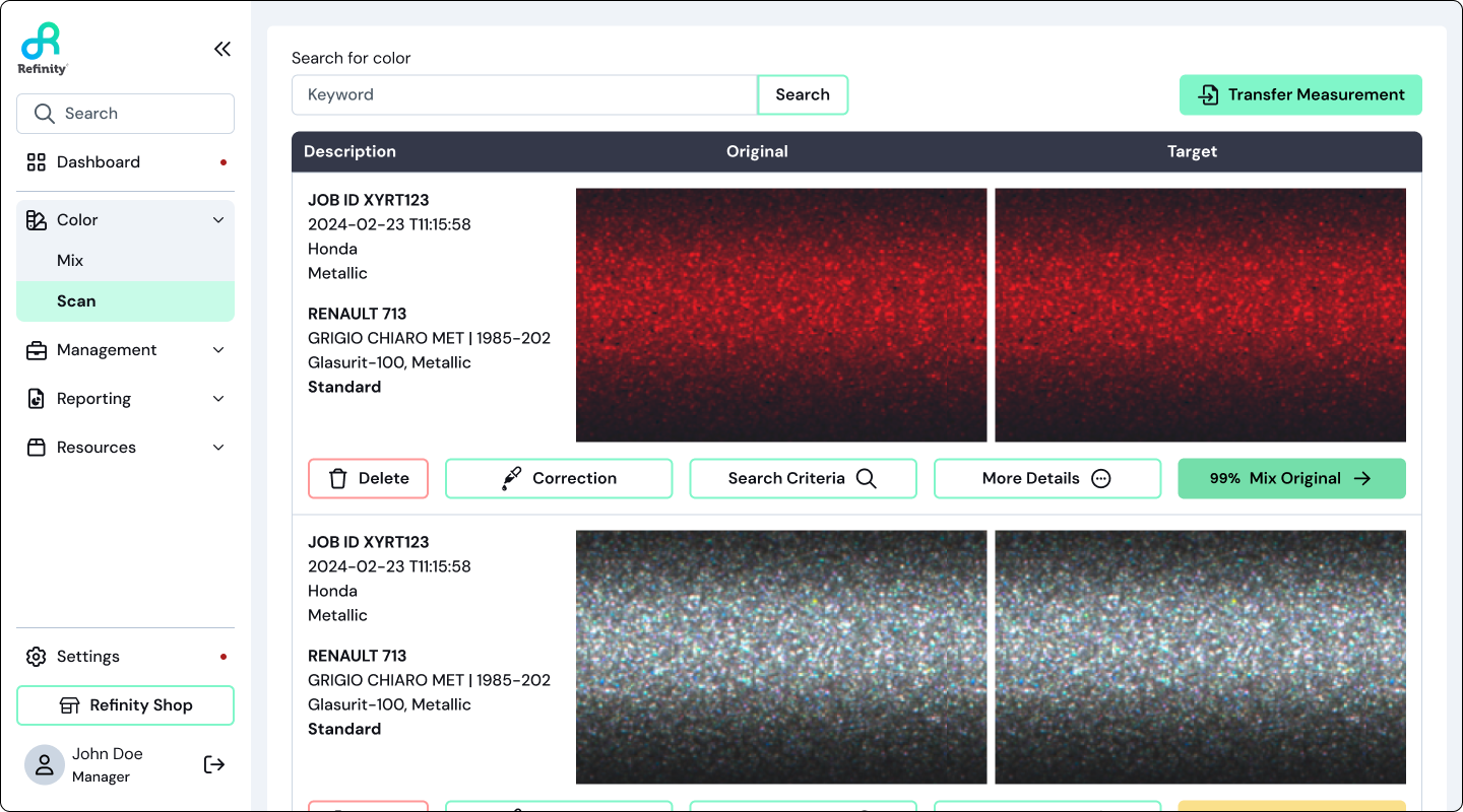
Redesigned the score component. Reduced from a dominant card element to a compact, right-aligned button with a color-coded percentage tag which is one data point among several, rather than the headline metric.
Increased image sizes. Giving painters the visual fidelity that accurate evaluation actually depends on, with action buttons repositioned beneath each image.
Part 2: Mix
The fix here was more direct.
Five pages became one. A consolidated stepper brought every selection into a single interface, eliminated page loads between steps, and made navigation between choices immediate and non-disruptive. Painters could move forward, revise, and correct without losing flow or restarting from the beginning.
The decisions themselves didn't change — only the efficiency with which painters could move through them. The design system already had the components to support it; once the problem was clearly framed, the solution followed naturally.
Validations
Both redesigns were tested with active painters through working prototypes before development.
15 active painters across 3 regions, 5 per region. Hi-fi prototypes, tested before any development began.
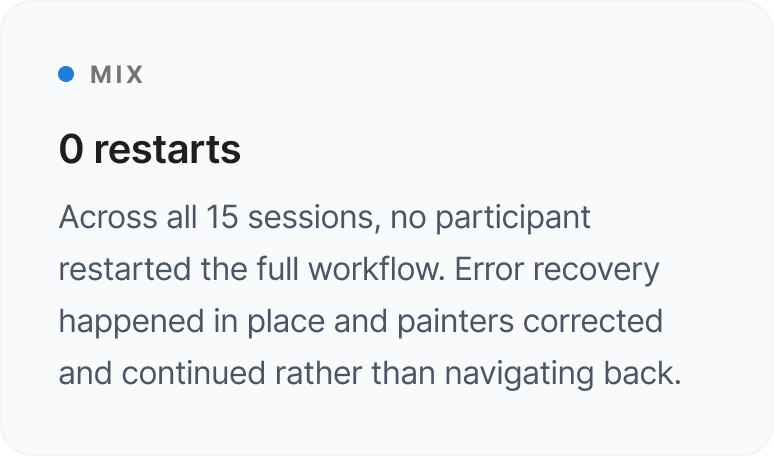
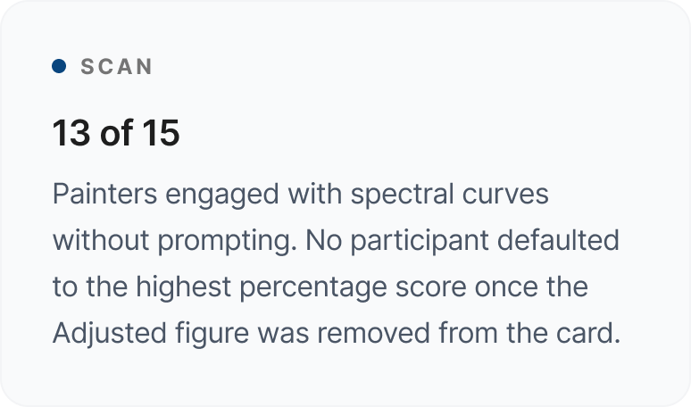
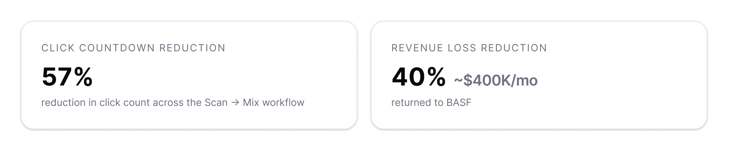
The hesitation, backtracking and abandoned flows that had defined the legacy experience largely disappeared. The 57% reduction in click count across the full Scan → Mix workflow, measured post launch, confirmed what prototype testing had already suggested: the friction wasn't inherent to the task, it was built into the design.
Finale Scan Experience
The final Scan experience with spectral data front and centre, score as context, not conclusion.Two problems. One cause. Precise fix.
Not a platform overhaul but precise changes to information hierarchy, workflow structure, and the relationship between what the system outputs and what the painter actually needs.
OUTCOME & IMPACT
This project also fed into a broader BASF design system. Patterns and components from both workflows were adopted across their wider product suite, extending the impact beyond the Color Module.