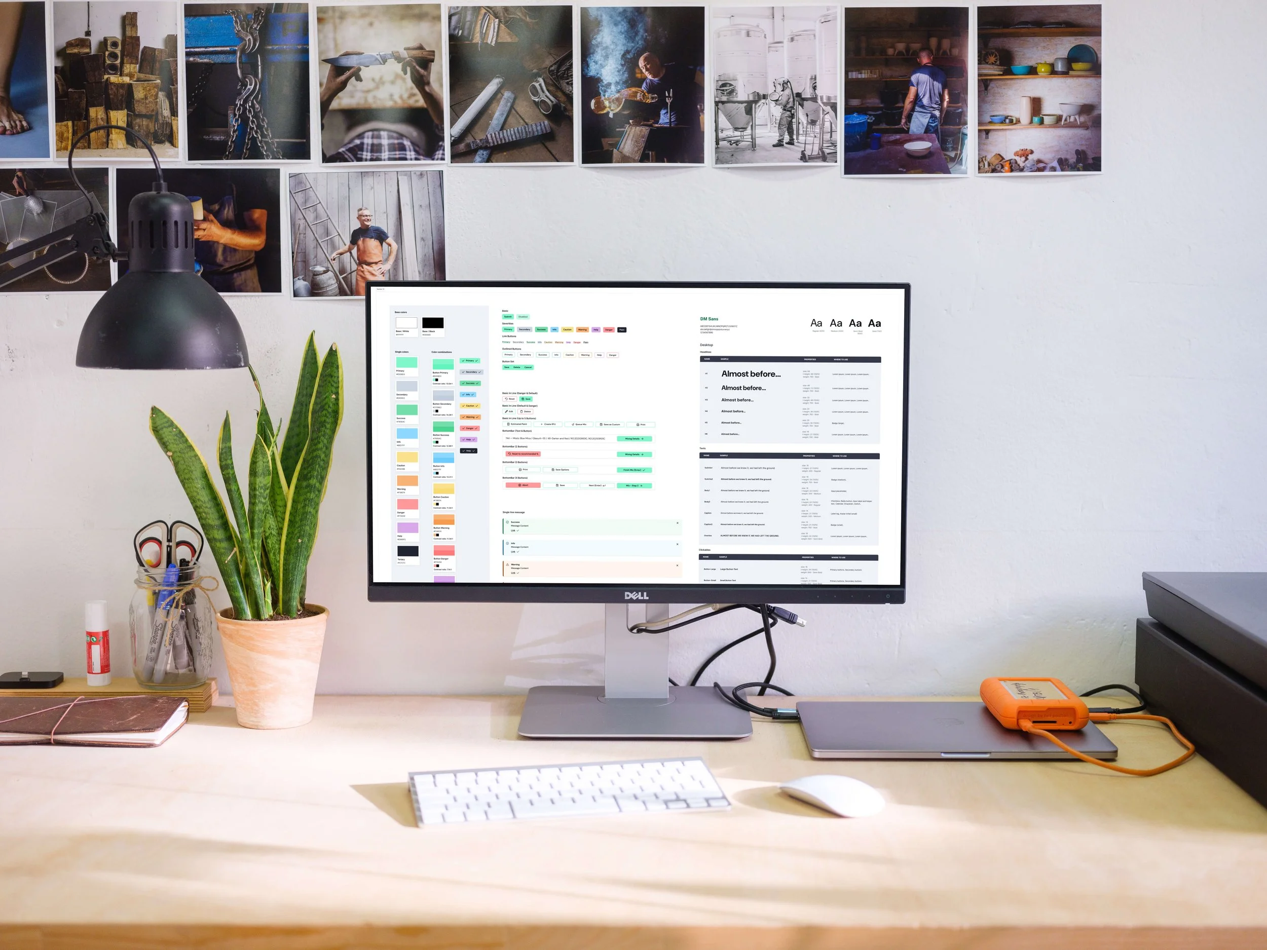
Evolving the design system from fragmented to foundational
When I joined the Refinity team, there was no shared design system. UI decisions were made in isolation, components were inconsistently built, and the product's visual identity was tied to individual paint brands rather than the product itself. Designers and engineers were building on top of fragmented foundations and it was slowing everything down.
Role: UX/UI Designer
Client: BASF Coatings
The Problem
No shared component library in Figma
Inconsistent UI patterns across the product
Brand identity tied to paint brands instead of the product
Difficult for designers and engineers to scale or maintain UI
The Cost
Constraints
No dedicated design system owner initially
Product already in production
Multiple brand themes in use
Engineering wasn’t using PrimeNG
The cost wasn't abstract. Every new feature required reinventing decisions that should have already been made. Inconsistency was compounding across the product, and with multiple brand themes in production, there was no single source of truth for anyone.
Time: ~6 months (foundational phase)
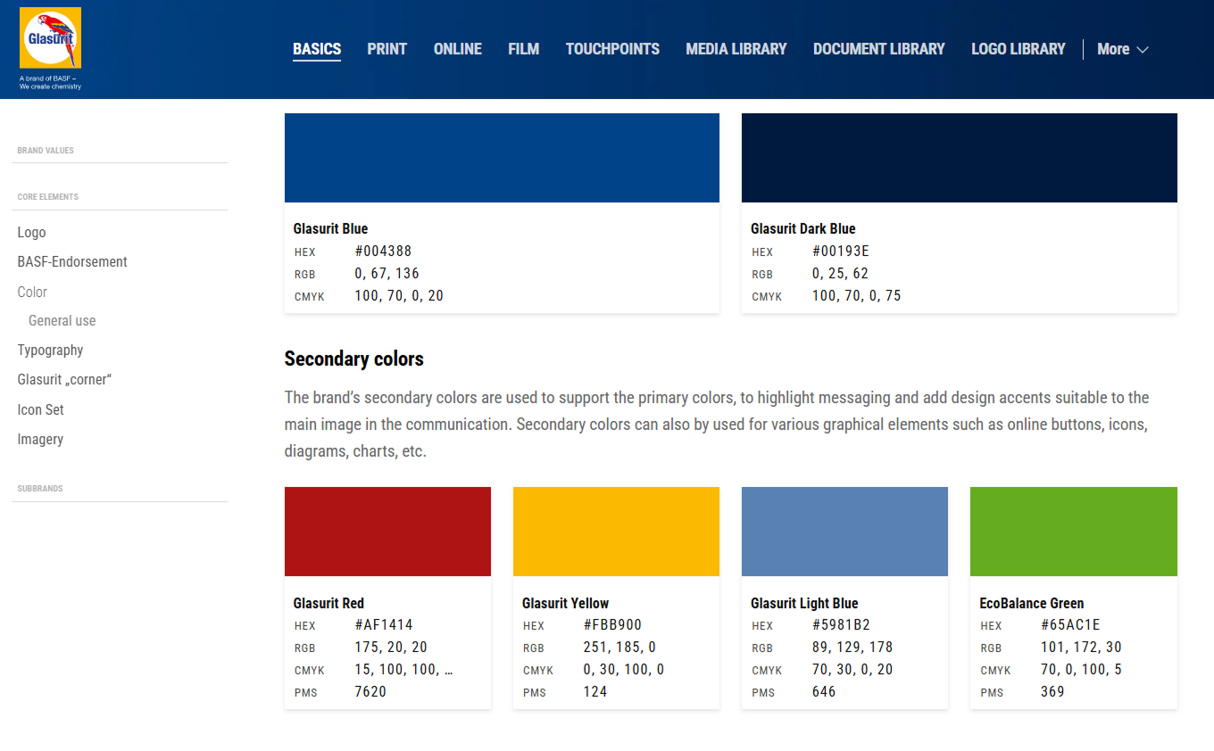
Paint brand 1 color palette
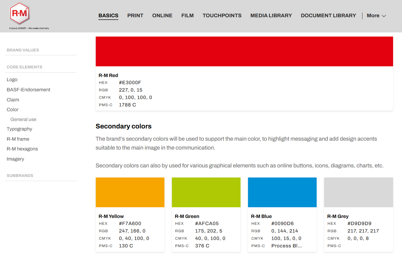
Paint brand 2 color palette
The team decided to move forward with Refinity branding instead of individual paint branding.
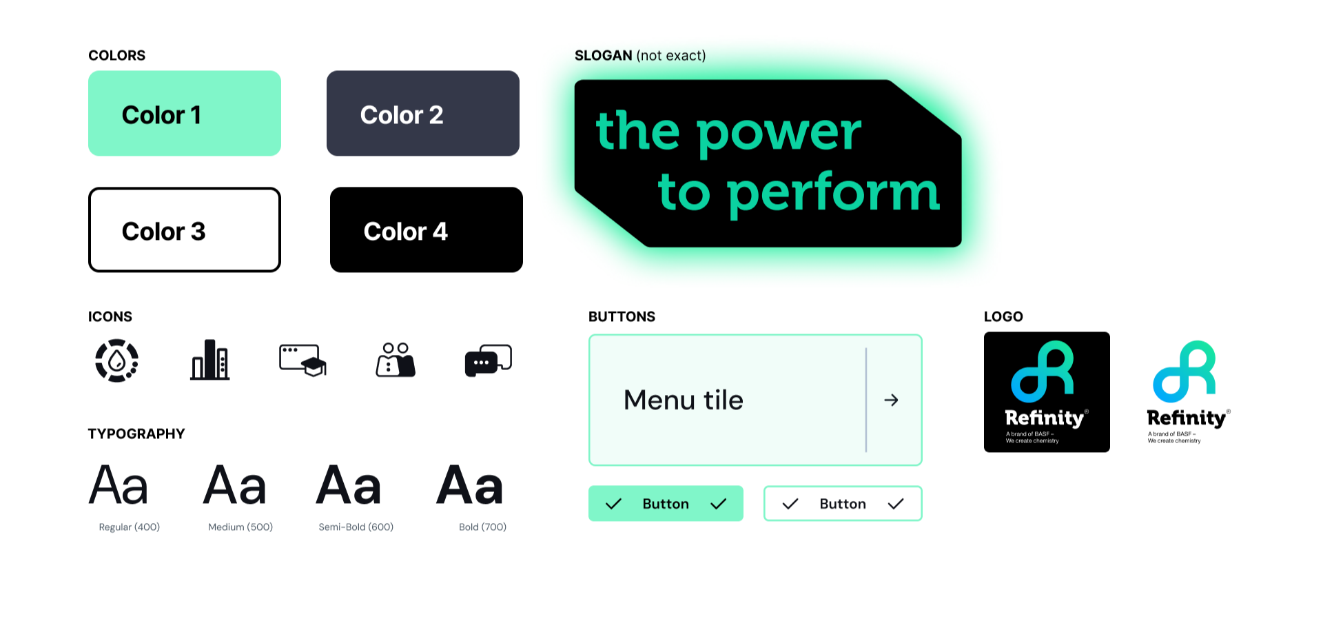
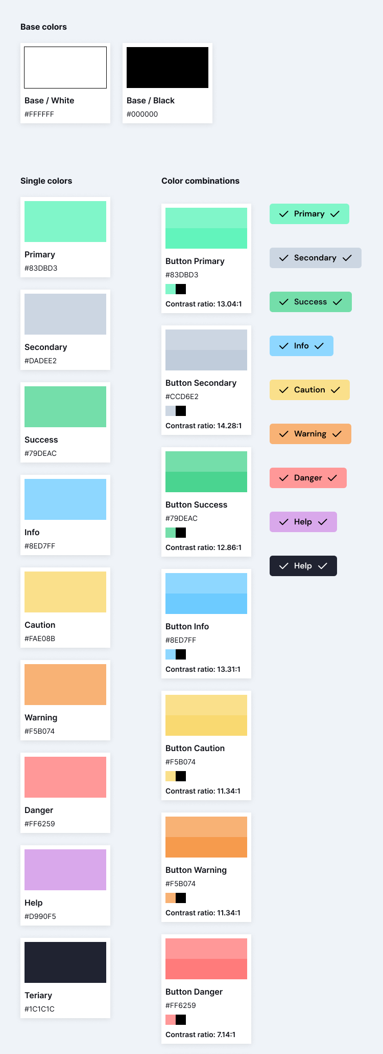
This is an example of the first iteration of the color palette and design system foundations, using the Refinity logo as inspiration for the overall style and color palette.
Paint brand 3 color palette
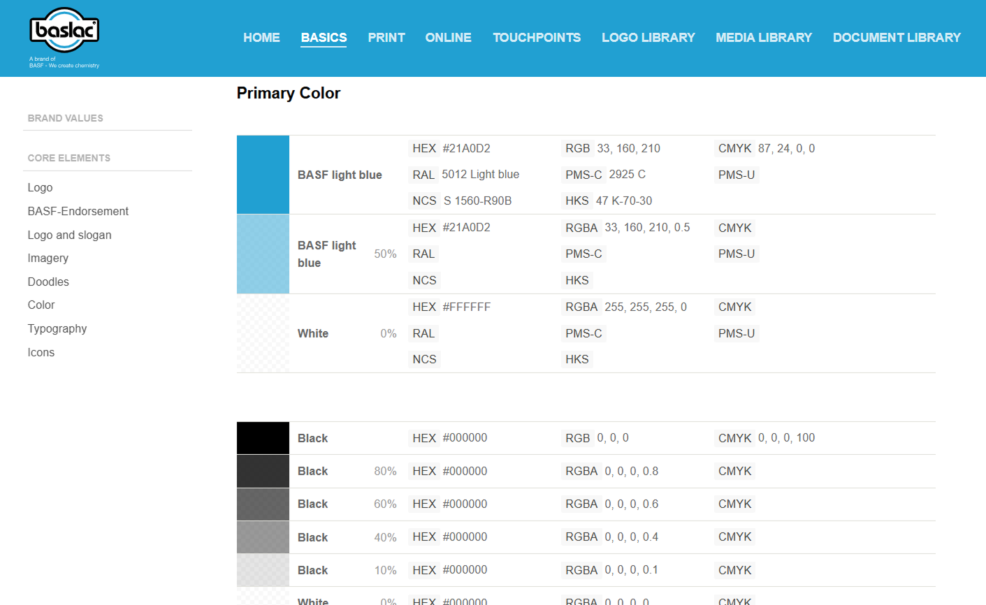
Depending on the type of paint brand a shop would use, that would be the UI they would see in the application.
System Goals
Define product theme
Shift away from paint brand driven UI toward a unified visual identity.
Enhance consistency
Ensure a unified look and feel across all components.
Increase efficiency
Streamline the design and development process to reduce time-to-market.
What I started with
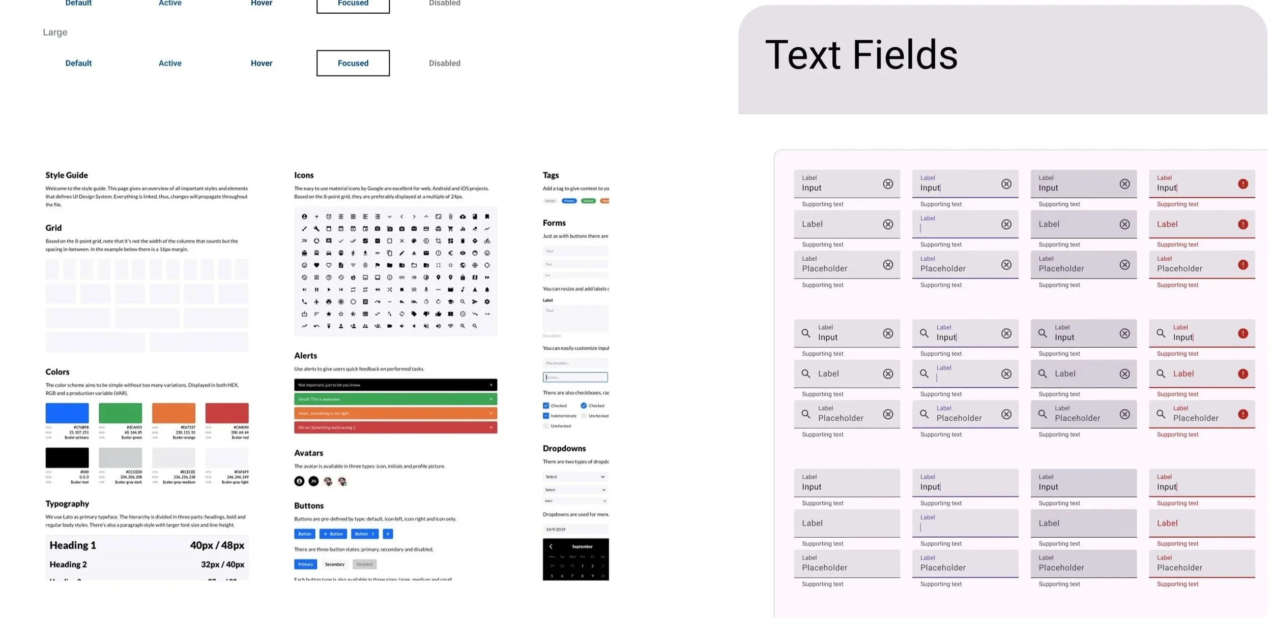
Fragmented libraries
Multiple design systems with different brand styles
Outdated UI
Approach
Audit & Assess
Auditing existing UI and patterns to identify inconsistencies and gaps
Create Color System
Rooted in the product logo while allowing controlled brand customization
Create Foundation
Designing foundational components from scratch in Figma (buttons, inputs, tables, typography, spacing)
Supporting the Transition
Transition to a dedicated design system designer through documentation and collaboration.
What I Delivered
Color System: Working with Branding and Marketing, I built a primary palette rooted in the Refinity logo. This was a deliberate move away from paint brand driven UI toward a unified product identity. I pushed further to get secondary and tertiary UX colors approved as well, so the system could handle real interface needs, not just brand moments.
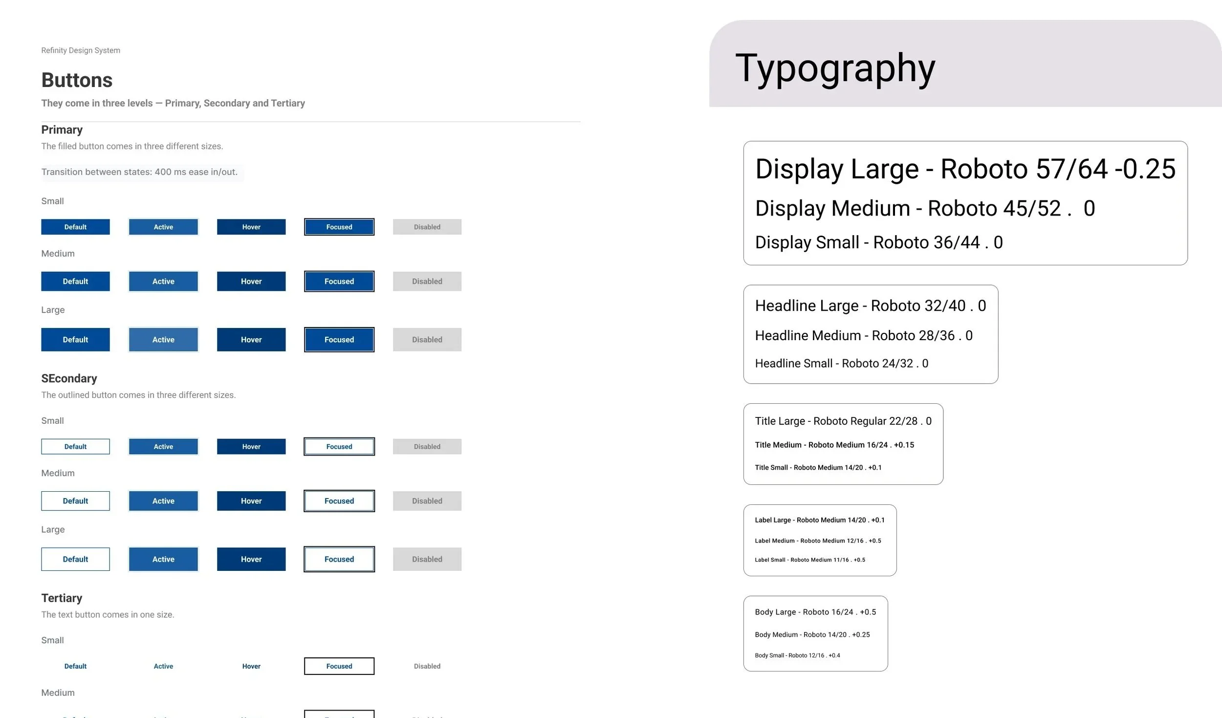
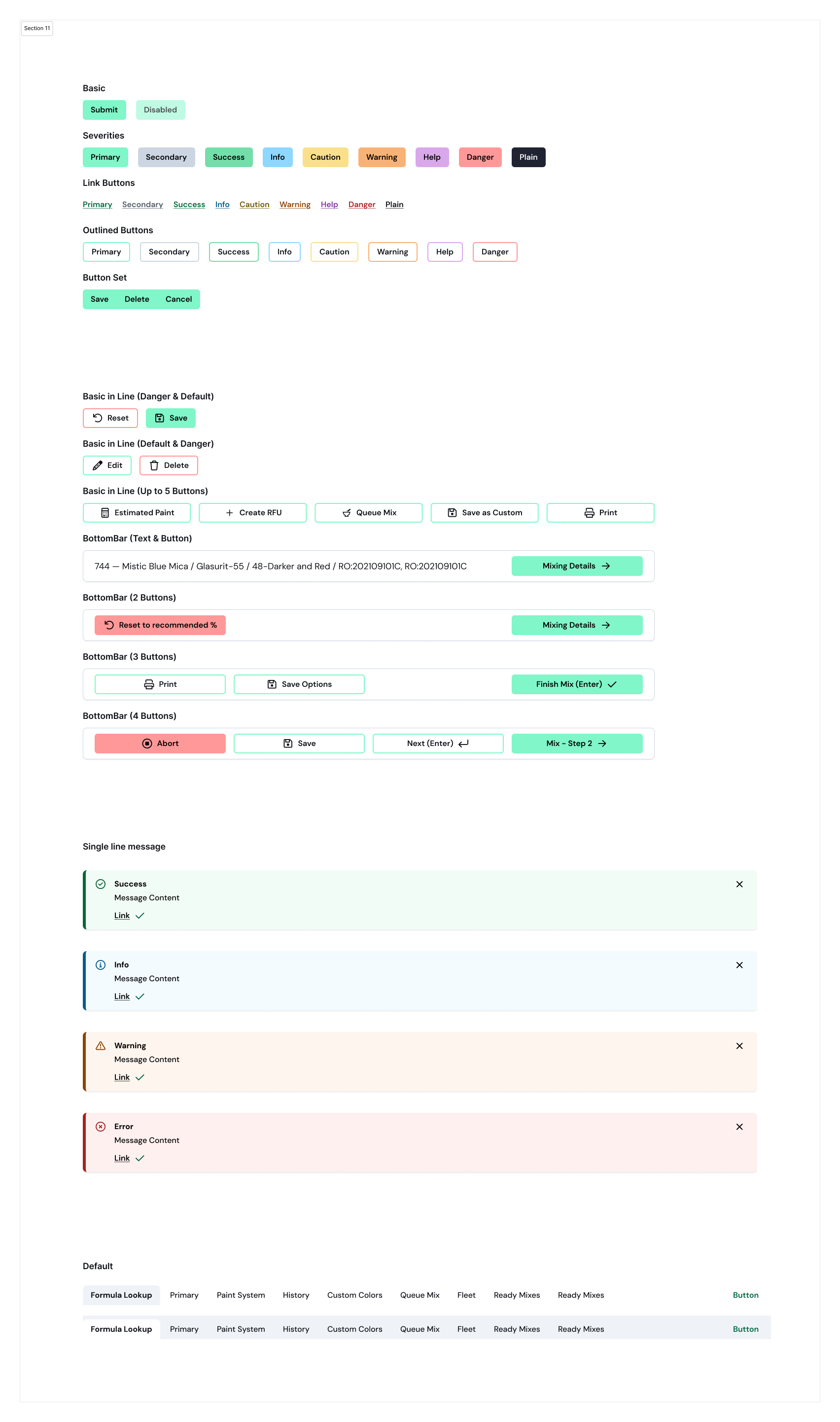
Foundational Components: Standardized button styles (primary, secondary, outlined, and button groups) gave the team a shared language for the first time. Consistency where none had existed before.
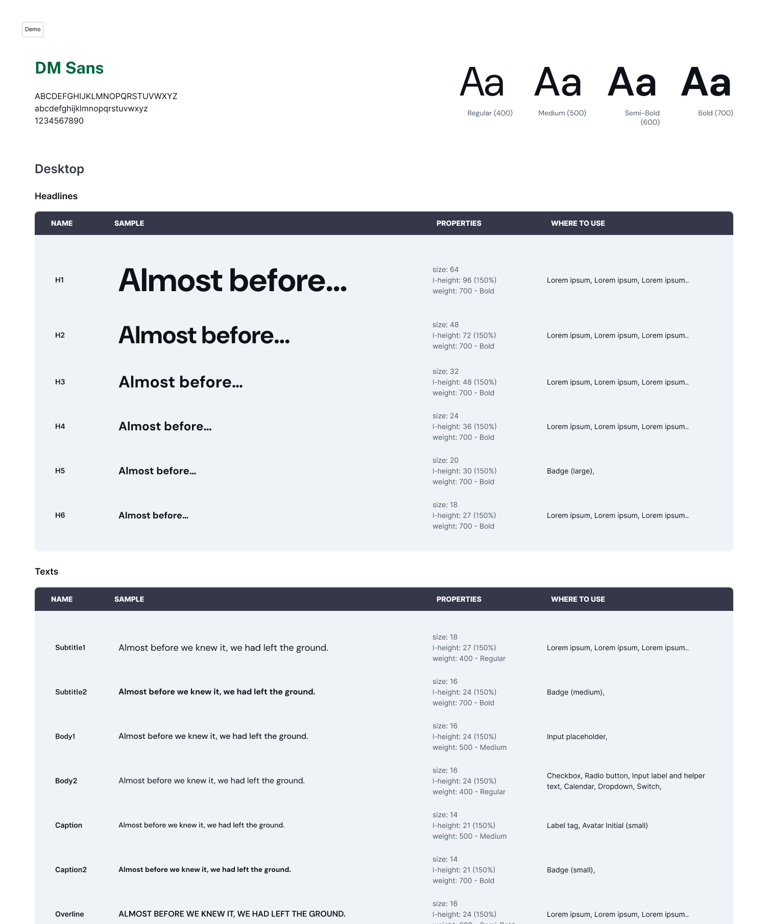
Custom Components: A fixed bottom action bar kept critical actions visible regardless of scroll position which was a known friction point that had no solution before. Tabs shifted navigation away from a strictly linear flow, letting users move dynamically between sections rather than in and out of individual modules. The font was updated to DM Sans to reflect the new branding direction, established before a dedicated design system designer was ever hired.
Theming Architecture: A token based approach allowed for future brand theming and maintaining a clear separation between core system styles and brand overrides, so flexibility didn't come at the cost of consistency.
Supporting the Transition
As the product matured, we hired a dedicated design system designer. I partnered closely during the transition, handing off foundations, patterns, and rationale to ensure continuity.
This is the current design system:

Output
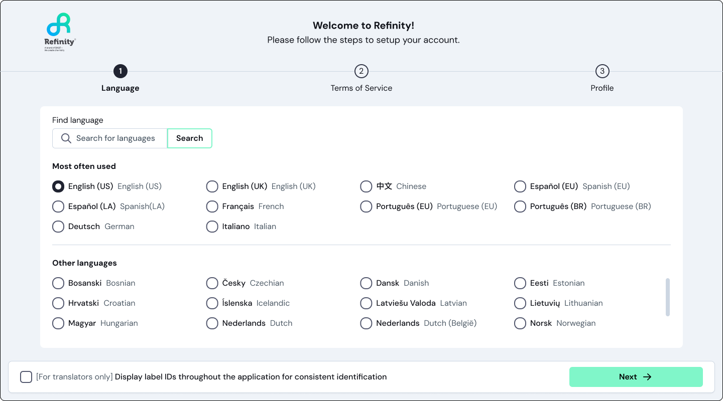
User onboarding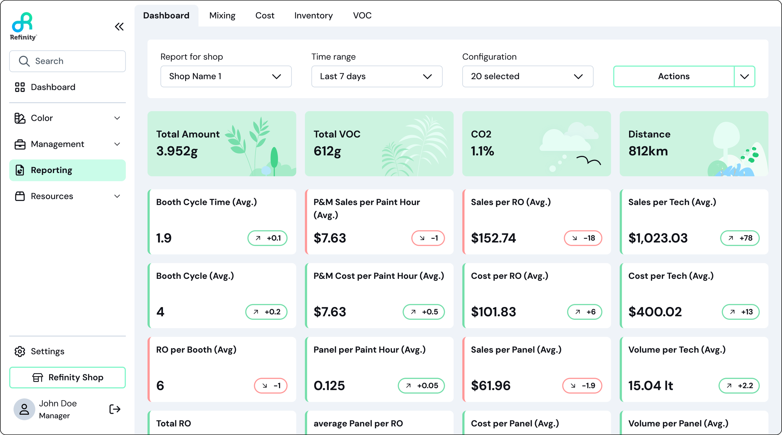
Reporting: KPI dashboard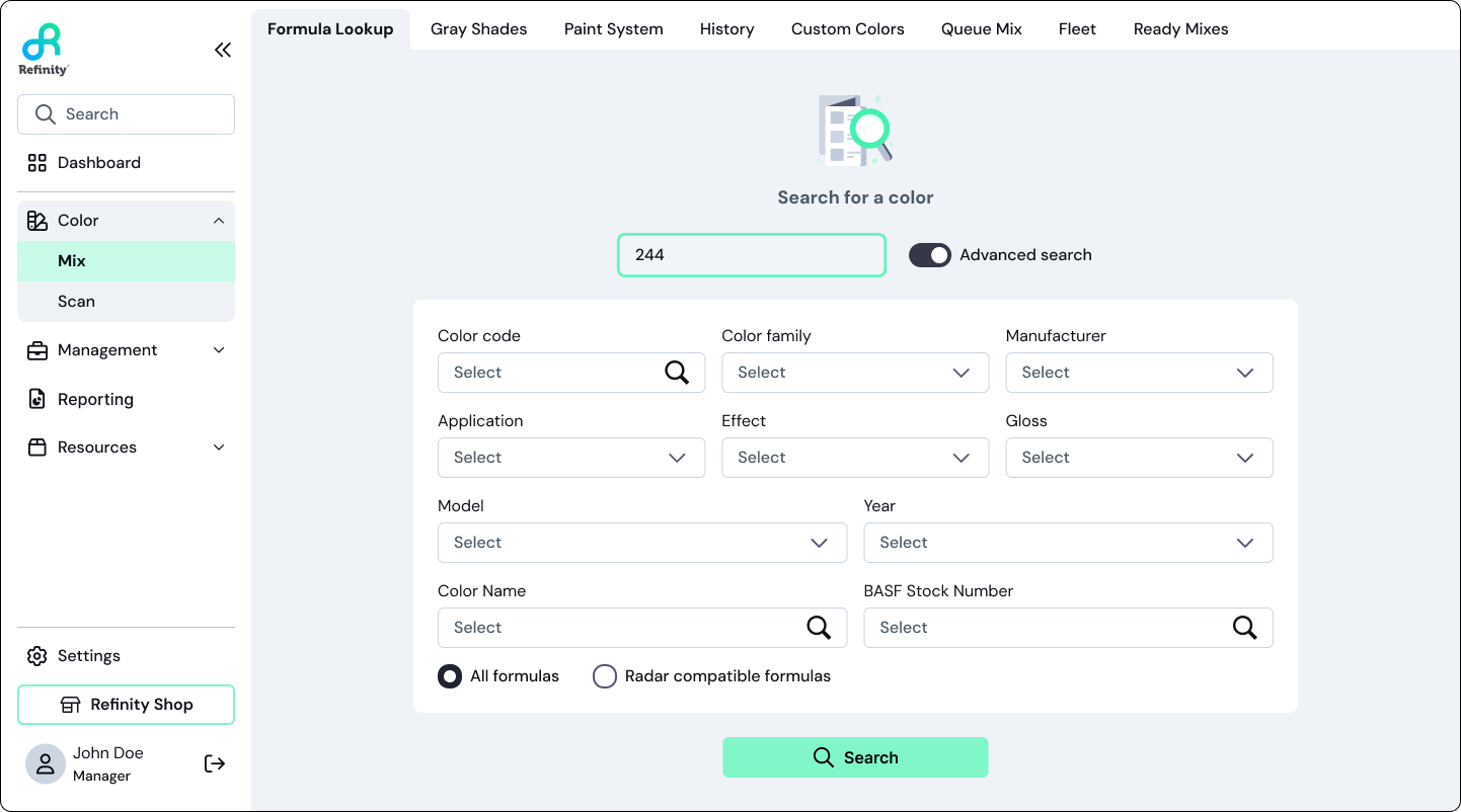
Formula lookup : advance search filter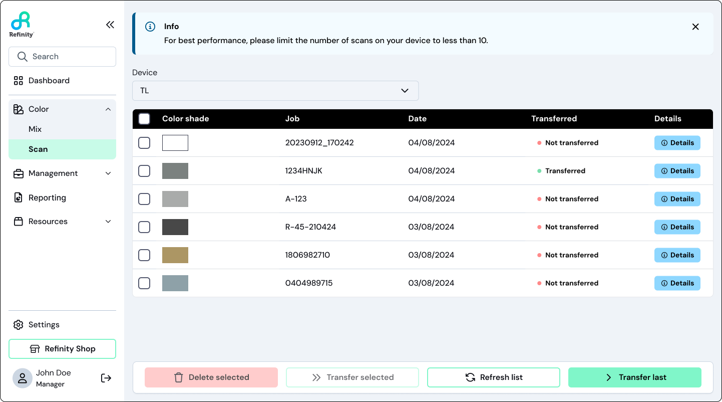
Scan: color transferImpact
Increased Efficiency by 83%: The streamlined design and development process reduced the time required to bring new features to market by 83% for design and 75% for development, meaning the small team could now strategically think through UX without needing long lead times to put together UI. This process is now 6x faster.
Define Product Theme: Refinity's visual identity shifted from fragmented paint brand UI to a unified product identity positioning the platform at the forefront rather than in the background of individual brands.
Improved Flexibility and Scalability: The new system allowed for easier adaptation to new design trends and user requirements, ensuring the product could evolve with the market. Changing global variants and updating hundreds of screens across source of truth files became a simple operation.
What This Was Really About
This wasn't just a design systems project. It was about giving a product the foundation it needed to grow — and making sure that foundation could outlast any single designer, including me.