Bridging the Gap between Opera and Accessibility
Role: UX Designer
Skills: UX Research, Wireframing, Prototyping, UX/UI Design, Usability Testing
Client: Alexandra Nowakowski
Context
Opera has been around for over 400 years with a rich and polarizing history. Although this form of theater is enjoyed by many around the world, some may say that Opera is an acquired taste.
It’s a performance typically given in an opera house, accompanied by an orchestra, where characters play out a storyline through singing in many various languages including Italian, French, and German.
Although its long-standing presence in the arts, opera is misunderstood by many and is still perceived as entertainment for the upper middle classes. There are other barriers to entry into opera including the ticket prices, opera feeling exclusive, and it is difficult to understand.
Background
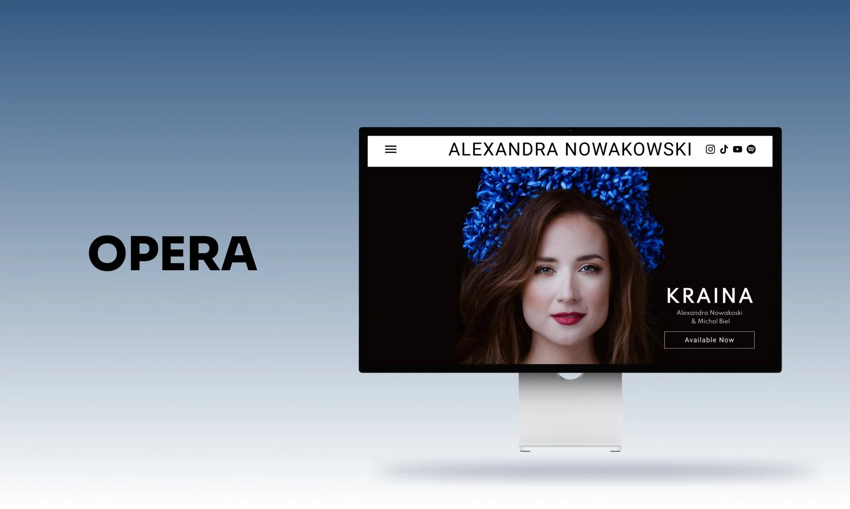
Alexandra Nowakowski has been performing on the world’s leading opera and concert stages for 8 years. In 2022, she released her debut Polish album, Kraina, which translates to “Homeland”.
This album works like a puzzle piece in Alexandra’s mission to bring accessibility to opera by educating audiences who might have at one point felt alienated by opera or were never familiar with it. The album is also unique in that it promotes and highlights the rich and beautiful history of Polish opera. Similar to its European counterparts, such as Italian and French opera, Polish opera has not received adequate investment and opportunities to flourish.
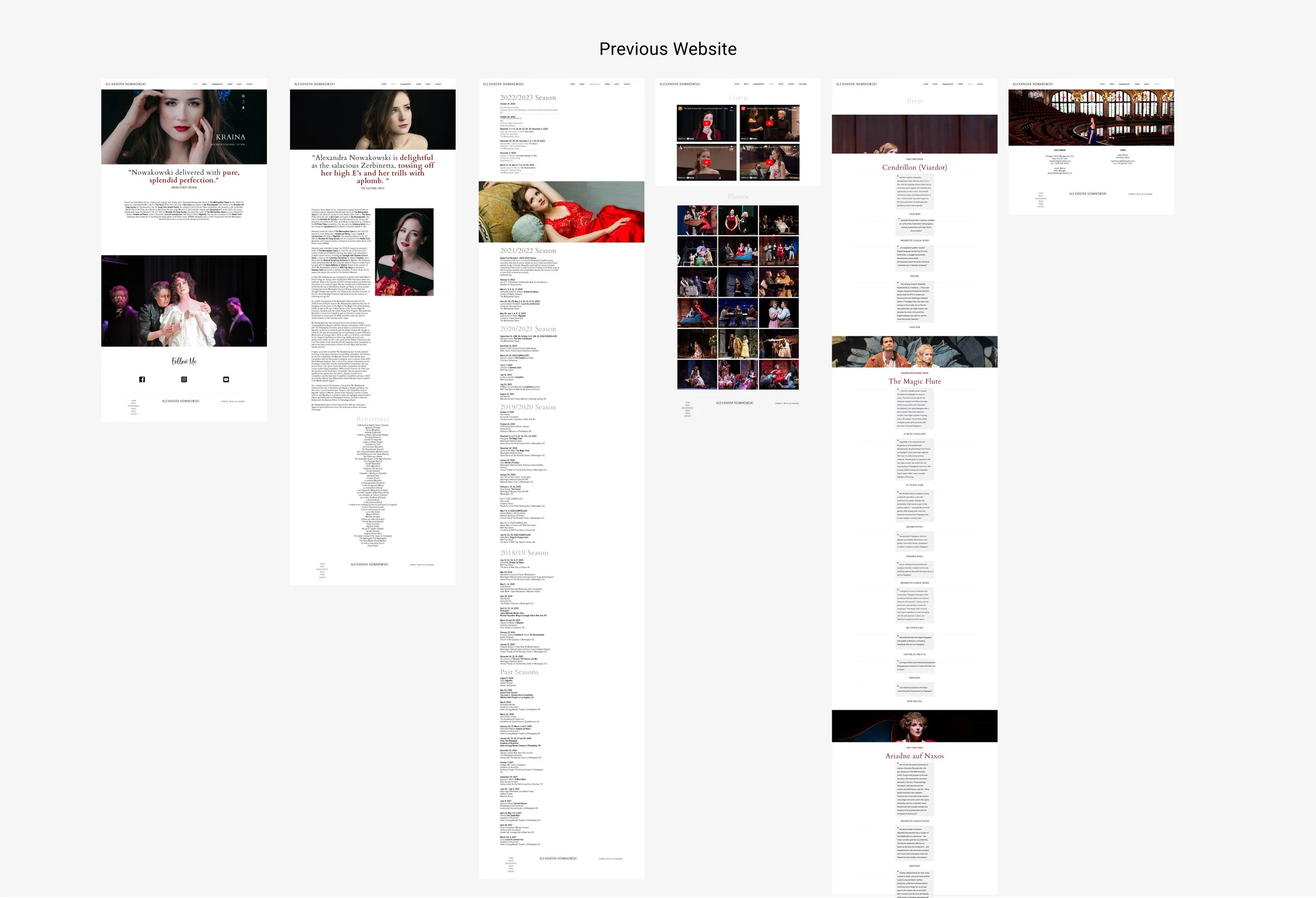
Alexandra is really excited about educating the public and debunking misconceptions about opera. At the start of this project, Alexandra's website had limited information and difficult access to her new album. Alexandra and I worked to understand how might we create a seamless user experience that both educated users on Opera and encouraged the purchases of her new album, KRAINA.
The Challenge
Time: 2021
We set out to answer “How might we bring equity to a 400 year-old art form?
In order to do so, the following was proposed:
Provide customers with access to her album so they can learn more about Alexandra and purchase her work.
Provide customers with performance tickets with linked external sites.
Educate her audience on the background and accessibility of opera so that they feel comfortable with attending to break the stereotypes surrounding opera.
Key Note*: The new album is written in Polish which has a lot of significance in Polish and opera culture. Because opera is mainly performed in Italian it is important to Alexandra to create music in Polish and continue the lineage of opera within Polish culture.
Process
Research
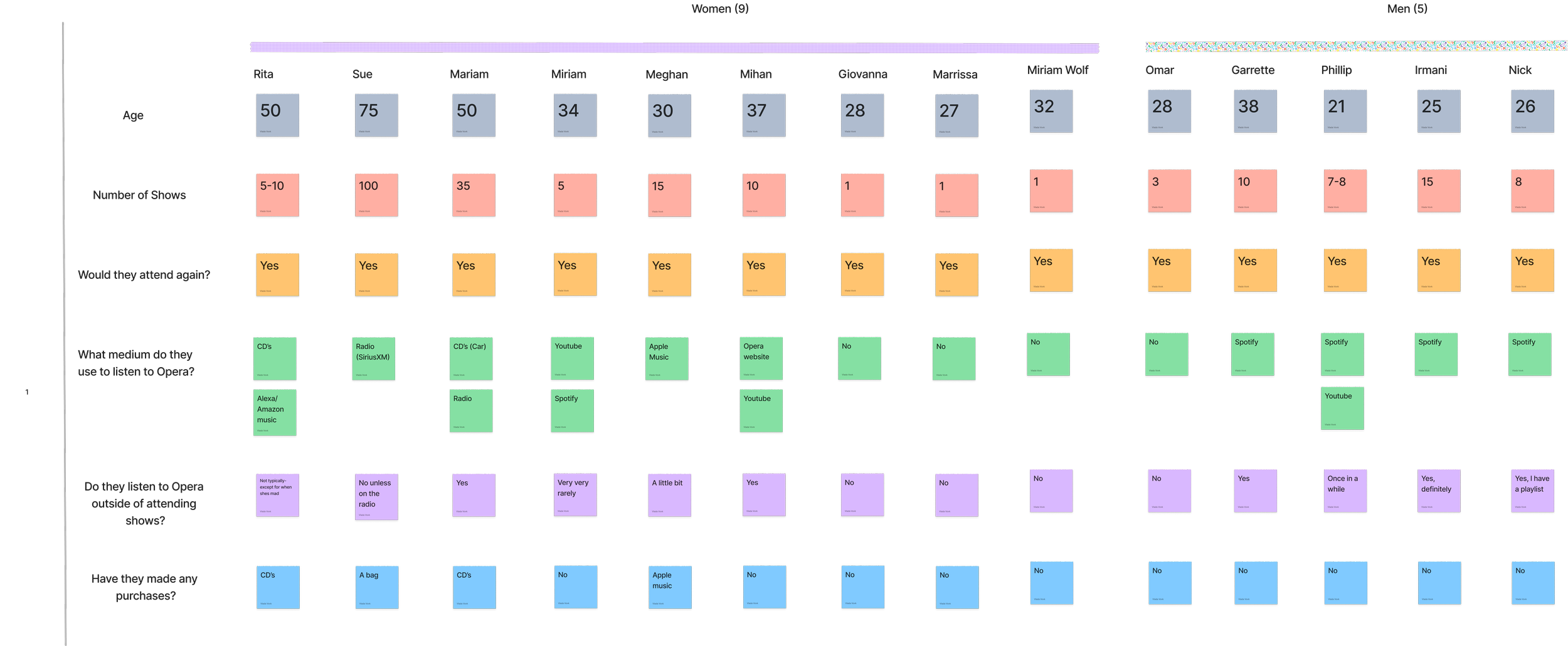
As I began the research phase of this project, we set out to understand the public’s perception of opera. This was done so through Guerilla interviews at the Metropolitan Opera performance. I interviewed 14 participants from the ages of 21-75 years old.
I focused on the following set of questions:
How many times have you attended an opera show?
Can you describe your experience?
Did you have any preconceived thoughts before attending your first opera?
Did you or would you attend again? Why or why not?
Do you listen to opera music outside of attending shows? How often? And through what medium?
Have you made any purchases related to Opera outside of a ticket to a performance?
The attendees naturally broke off into 3 main sections:
First-time goers
Opera-goers who go on occasion
Die-hard seasoned veterans
Through these 14 conversations, my aim was to understand their experience and views on opera. I specifically sought to understand how they learned about opera, what kind of role does opera play in their lives, and what is their viewpoint on opera, both in the present and historically.
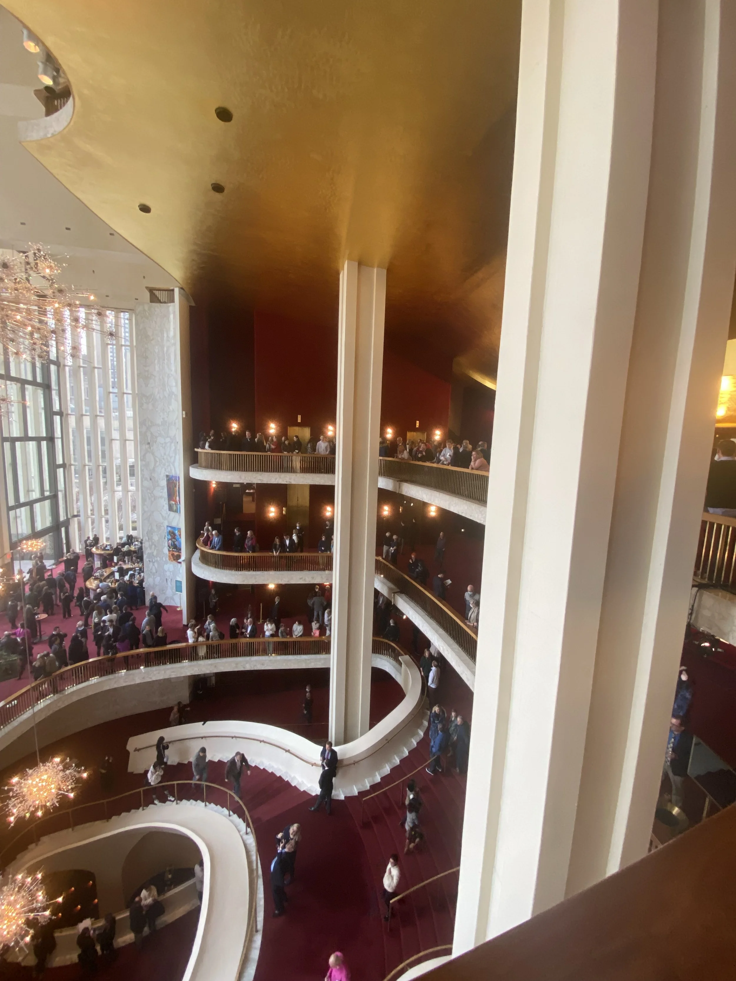
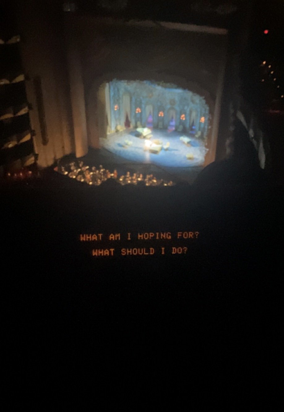
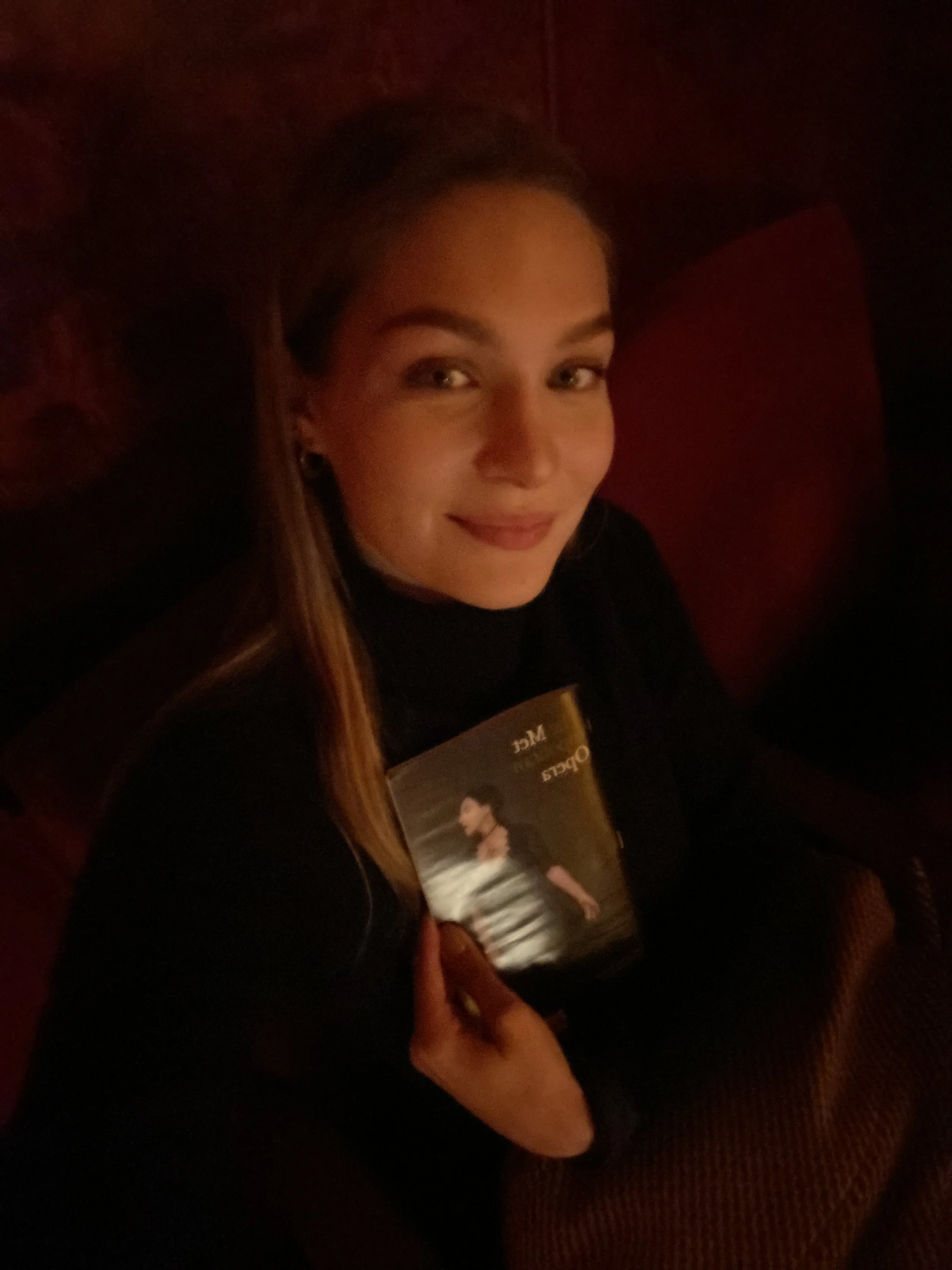
At the scene:
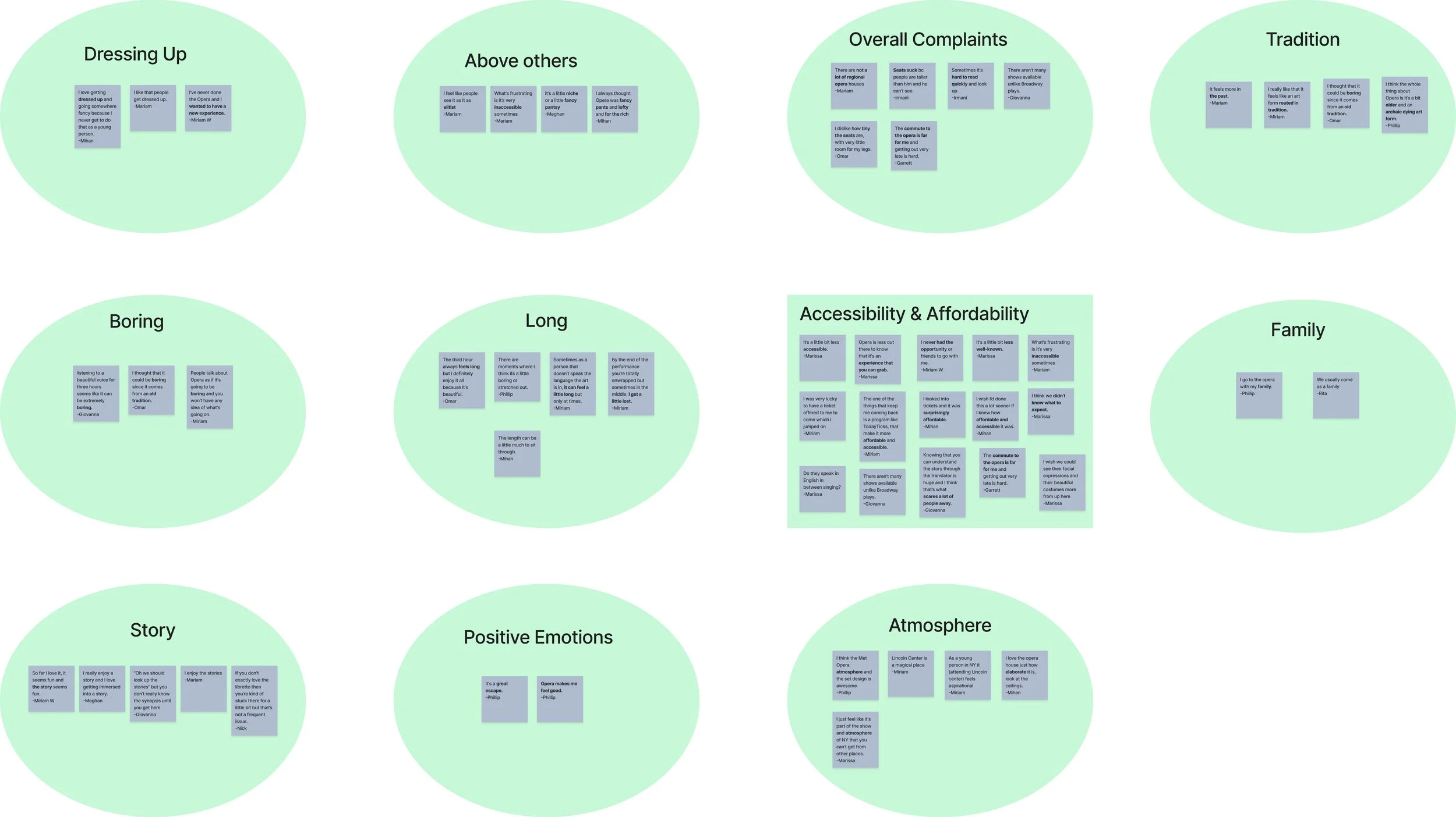
Compiling the research:
User Insights
After listening to our interviewees’ experiences, I synthesized their comments through affinity mapping. I identified key themes and actionable insights to help inform our design decisions. There were several takeaways and themes that were noted. There were both positive as well as improvable points of feedback.
The improvable and the challenging feedback I received was that:
Tickets are very expensive.
Opera is very ‘fancy pants’, meaning it might feel alienating to unfamiliar audiences who might not understand if there is any appropriate attire or behavior at the opera.
It might be challenging to understand what is going on, especially if the show is in a different language and doesn’t provide subtitles or explanations.
Opera might feel inaccessible in that there may be many barriers to entry including ticket prices, lack of knowledge around the art and history, and a lack of knowledge about the field entirely.
The shows often can feel “long and boring”.
There were many positive points of feedback as well, including :
Viewers get very immersed in the storyline.
The atmosphere of the Opera house is part of the experience that attendees enjoy.
Attending the opera is a family event for some.
Opera gives people the opportunity to get very dressed up which some people say they don’t have the chance to do often.
Opera makes people feel good in that it allowed the audience to get invested in the storyline and feel exhilarated by the performance.
Single Usability Metric Test
In addition to understanding the public’s perception to opera, I wanted to understand how accessible Alex’s website is to allow her to meet her goals.
I conducted a usability test with Alex’s website to see how long it took users to:
Purchase a ticket to Alex’s performance (average of 0.38 sec)
Find and buy the album, KRAINA (average 1 min 25 sec)
There were 15 users tested. Though the averages are rather quick, the behavior of users while taking the test is as follows:
One user clicked around on the entirety of the website trying to locate the link to purchase the album. The user began to be very frustrated, at first unable to find the link.
Another user was methodical, working to understand where the link to purchase the album could be. He accidentally stumbled on the link in the hero image.
The takeaway was that though users could find the link to purchase Alex’s album, it was a confusing and frustrating process.
Ideation & Wireframing
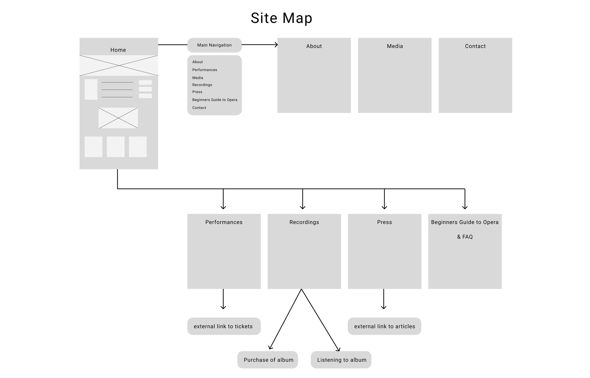
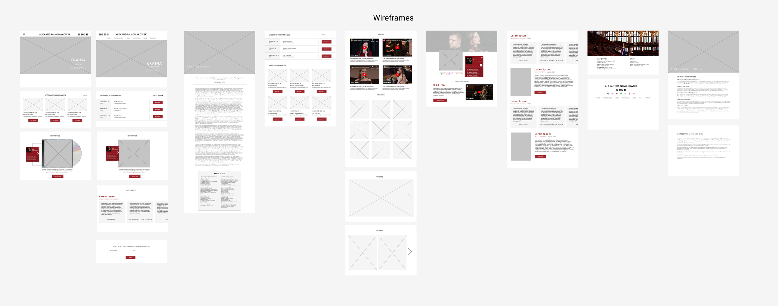
My main focus was the home page which was often the very first entry point for the larger audience. Secondly, I was ideating on the Beginner’s Guide to opera, a document that would educate users that are unfamiliar with opera. I explored different solutions and sketched out the site map.
From this page it was imperative that customers had access to Alex’s:
New album
“About Alexandra”
Newsletter
Alex’s performance schedule
This document took shape on a page, that was accessible from the home page and included common misconceptions and frequently asked questions for Alex specifically.
Solution
Using research insights and feedback from Alexandra, I designed an end-to-end platform that educates users about opera and showcases her previous work.
The result of this project included:
A clean design with easy and immediate access to her album.
An intuitive navigation system that allows visitors to easily find what they are looking for and give them the ability to purchase tickets.
High-quality images and a Spotify plug-in that showcase the opera artists' talent and album.
Creating an informative page that explains what to expect from Opera.
Sharing interesting facts and frequently asked questions Alex receives on social media.
Impact
For the artist:
Improved brand perception: A visually appealing and user-friendly platform helps position Alex as a serious Opera singer which can lead to more opportunities and collaborations.
Better engagement with fans: Through social media and online presence, the artist can connect with fans on a deeper level and create a following online and in person..
For the public:
Increased awareness of opera: By offering educational content, this project can help educate the public on opera as an art form and showcase its beauty.
More accessibility to opera: Creating a user-friendly platform with educational content can allow people who have not previously had exposure to opera to feel like opera is more accessible and lead to more interest and engagement.
Single Usability Metric Test Part 2
After the prototype was created, I conducted a usability test with the same 15 users to see how long it took them to complete the same tasks.
Purchase a ticket to Alex’s performance
The previous time was an average of 0.38 sec
The new design had an average of 0.17 sec
Find and buy the album, KRAINA
The previous time was an average of 1 min 25 sec.
The new design had an average of 18 sec.
The takeaway was that users were able to complete the tasks significantly faster and showed no signs of frustration or confusion.